
Hensel Phelps
Proposals
All proposals are confidential and cannot be displayed
I've really grown to love the proposal process as it melds my passion for organization and strategy with my passion for graphics and visuals. It's the greatest feeling in the world to win a contract. It proves that your hard work really made a difference, and your client really appreciated everything you provided. It really feels like you're providing value and it's crazy to say that I've contributed to the company winning over $2 billion worth of work. As a Senior Marketing Coordinator, I consistently serve as the Hensel Phelps Marketing Lead on RFQ/RFP pursuits, as well as the interview process the team participates in during the pursuit as a whole. If you are not familiar with the pursuit/proposal process, I have written a blog post all about my experience and the general processes we go through to reach the final product at all stages!
In my role, we often take the full lead on the RFQ/RFP process, meaning I will lead meetings, develop a responsibility matrix utilizing the owner documents and assign responsibilities to the project team. I will also create a fully-fledged template for the team and lead the team in collecting all of the data necessary to complete the document. I will also provide support and feedback in any one-on-one sessions and interview prep, including template, design, layout, etc. for any PowerPoints.
With Hensel Phelps, I've had the opportunity to hear some really great feedback on the proposals I've lead from prestigious owners such as Chaffey College, Cal State Long Beach, Providence Health and Services, the California Department of General Services (DGS), all raving about the visuals, layouts, graphics, theming and even extras like a video we supplied.


Although I can’t show all of my work because of confidentiality, in my Cardinal Financial work I created a Homebuying Guide that displays a large document created in Indesign. In my past work for the Paso Chamber of Commerce, I also have two large documents there, one being the Business Start-Up Guide and the other the Economic Profile, that similarly showcase large documents created in Indesign.
Proposal Video
Video for a proposal submission to Cal State Long Beach
Although our team did not get shortlisted for this pursuit, we pulled out all the stops! This included a video I filmed and edited. The goal of this video was to appeal to Cal State Long Beach students and board members and let them know how excited we'd be to be on their campus and work with them to create an awesome space.
I started by storyboarding the video, sketching up what I wanted it to look like and what I wanted to prompt the interviewees to say.

Once I had done that, I came up with a list of questions to ask my interviewees and asked all Cal State Long Beach alumni if they could make the couple of days I was able to film. We had a whopping 9 CSULB alumni come in and film with us on a short notice and I was able to film and edit the video in just one week's time along with the other requirements of the proposal. Thankfully, the best news I heard about our submission losing was that the proposal and video were amazing and the college students on the selection committee loved the video.
GRIT Style Guide and Logo
The GRIT Logo is the latest logo I created for Hensel Phelps and is probably my favorite. GRIT is a training given to all employees within our region in their first to second years. Their goal is to teach employees valuable skills they can take into the field or supply them with the knowledge and understanding of the jobsites to put into their jobs in the office. They wanted a logo that could not only be used for our region, but for all regions around the company as a whole to implement nationwide.
I had an initial kick-off/brainstorming meeting with one of the heads of our GRIT training program, and after asking several questions about how he wanted it to look and feel, we created a vision board utilizing designs and ideas we had talked about. From there, I found vital components that I knew he and the company would gravitate toward. For example, in our discussion, I noted that he favored wordmark-style logos, and almost all of the logos he let me know he liked were geometric and strong.
I knew I wanted to create a simple and strong logo to go hand in hand with the training ideologies. I absolutely love the way it turned out and adore the texture and ruggedness.


Halloween Golf Tournament Collateral/Illustrations
Every year, Hensel Phelps hosts a charity golf tournament that supports local hospitals. If anyone knows me they know my favorite holiday is and will always be Halloween. This project got my creative juices flowing. I was tasked with a whole creative overhaul of the Halloween Charity Golf Fundraiser in 2022. This included several pieces of collateral including flyers, banners, signage, social media, and of course, a logo!
It had been a while since the graphics were refreshed for this and after just having finished a won a $500 million dollar proposal I was ready to get creative. Prior to being given this project, I bought an iPad, after looking at them longingly for years, and I honestly don't think I could have done this without it. This was one of those projects where I knew what I wanted to do immediately. Cheesy as it is one of my favorite movies is The Karate Kid and I've always loved the idea of dressing as a skeleton to mimic the Cobra Kai team. I thought it would be kind of hilarious to make it look like the skeletons were playing golf and had dressed up for the tournament, much like the costume contest that is incorporated in the charity golf tournament. This lead to the collateral below and many more banners and other collateral that I'm not able to show due to confidentiality.


Halloween Charity Golf Fundraiser Logo
This logo is one of my absolute favorites, and I was so excited to see it used. It features my main skeleton in the clown costume in a badge-type logo. This is used annually on the email communications, flyers, banners, and on the merch given to the golfers.


Open House Branding
Our SoCal Regional Office was being remodeled during the fall and winter of 2022. Once we returned, the marketing team was in charge of throwing the giant Open House event, which happened to coincide with Mardi Gras!
I was responsible for all of the branding, including a logo, signage, event map, flyers, posters, and other print collateral. I also took event photography and assisted in logistics and wayfinding.


Sticker Sheets
Sticker sheets and individual stickers for kids at a children's hospital project, but can be utilized at jobsites as merch/giveaways.
This has got to be one of my favorite projects to date. It showcases these cute mascots I've been developing for a few months and been using on various pieces of collateral in all different mediums. I mean, just look at how cute they are! And they are perfectly preflighted and ready to be printed. Our project team will be handing out these at the USD Dance Marathon event where there will be younger kids as well as college-aged students. They will also use them to hand out to the children in the children's hospital at their project. The marketing team also bought extra to use as giveaways for future events.


Logos
Custom logos created for various internal events and groups
Prior to me joining the group the marketing team rarely had logo/branding requests; however, after completing my first couple projects like the summer Olympics logo which was printed on stickers and hats, word spread like wildfire and I was creating more and more for our region.
Although proposals are the most high-priority task of my role as a Senior Marketing Coordinator, I still take the lead on all graphic-related tasks for my group. This means that any one-off logo designs, graphics, PowerPoints, etc. are my domain. I love that I get to express my creativity and fuel my passion for designing, while also having the ability to switch to my more analytical and strategic side on proposals. This really helps to quell the monotony of the days and weeks and keeps me passionate and ready for the next challenges.
Logo and branding design has always been something I've enjoyed. Although I love the creativity of designing, I often like to look at logos and branding as a puzzle. If you really think about it there are several components that could make up the entity that you are designing for, including the client’s story and vision, the company’s branding and standards, my ideas and conceptions of what may look good, and many more. I love the idea that it’s a puzzle for me to solve and the challenge to find something that utilizes the several concepts I'm being fed and spit out something simple and useful for the client that they ultimately want to continue to use.

FE Bootcamp Logo
FE Bootcamp is an annual training that first and second year field engineers go through to learn valuable skills to apply to the job site. When I initially got the request for this, they let me know that the only thing they wanted was a surveyor of some kind in the logo and that the rest was up to me. Oftentimes I get nervous when I get requests and the client gives me the full reigns because it could end up that I go in a direction they absolutely hate, and we start back at square one. To avoid this situation, I do my very best to have a strict set of questions to prompt the client to tell me their likes and dislikes in several different areas of design like color, example logos, fonts/typefaces, etc.
I was excited about this logo and had several ideas already flowing through my mind on what options I could come up with. Due to this, I presented four options to the requester and to my dismay, they chose my least favorite. In the slides to the right, I liked options 1 and 2; however they went with option 4 as their main logo and 3 as a sticker to hand out to the attendees. Although not my favorite logos, I do see why they ended up choosing those options.


SoCal Regional
Office Graphic
Although not the most intense project, I had the opportunity to create the hard hat sticker for the Regional Office Renovation Project team... Only problem was that they needed it yesterday. I was given the request and they needed it in the next few hours to send to print to get them in time for all of the people coming aboard to help with the project.
Thankfully, they wanted something I could do, an illustration of the Regional Office's exterior with the added Hensel Phelps logo sign that would be added as the last step of the renovation. The photo above shows is the cutout of the photo of the office that I used as inspiration, cut out in Photoshop. The illustration below was the final colored product. The next slide shows the sketch and outline of the final illustration.


Hensel Phelps Womens Network (W-Net)
Summer Splash Logo
W-Net, or the Hensel Phelps Women's Network, is a group of Hensel Phelps women who get together monthly and quarterly to meet and get to know each other to build relationships with women in construction. W-Net approached me to do a logo for their annual Summer Splash event. They gave me full reigns on whatever I wanted to do and just wanted it to be colorful and summery.
They ended up choosing the first logo and I adapted it into large posters and flyers for the event collateral (slides 2 and 3). The following slides are the additional designs I sent as potential directions we could go with.


SoCal Project Development Logo
About a year into my time with Hensel Phelps, my team and I realized I hadn't made a logo for us to use, and with our Project Development Roadshow coming up it was the perfect opportunity! The Project Development Roadshow is an initiative that the SoCal region is implementing to visit all of the project sites and give them a lunch and learn style presentation about what we do as a department and how they could help us in the procurement process, email campaigns, social media, event photography, and various other marketing sectors. Through the roadshows I've had the opportunity to visit multiple project sites all over SoCal including projects in Los Angeles, San Diego, Orange County and even Ridgecrest.
We ended up printing the second logo on stickers and giving them out to all of the jobsites when the presentation was done for them to put on their hard hats or other places. Although we chose to go with the second logo, the race was extremely tight in the team vote. I love the first logo and want to repurpose it in another design!


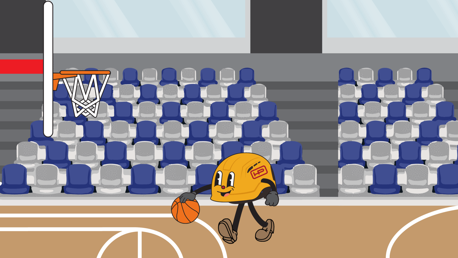
Cartoon Mascot
One of the most fun things I have done since being a part of the Hensel Phelps team is make up a mascot! He's a cute little hard hat turned KASK hard helmet that's eager to be a part of all types of collateral. With some spare time he was something I whipped up to be funny, but he's since become a staple in various mediums like stickers, email campaigns, holiday cards, etc.


Summer Events Series Branding
In April 2022, my first project at Hensel Phelps was to create a logo for the Hensel Phelps Summer Olympics. I remember wanting to really impress my team so I put a ton of work into creating several options that were fun and different than any of the examples I had seen in our archived files. Thankfully, my team was enamored with the options and the rest was history!
There are three events in our summer events series: the Summer Olympics, SoCal Surf Day, and the SoCal Golf Classic, which are all annual events that our new hires and interns for that year attend. They are super fun events geared toward fun and ultimately look to help employee retention. Over the last few years, I've been the point person for creating the graphics for the summer events which includes logos and graphics for digital internal campaigns, printed collateral, and merch such as t-shirts, hats, stickers, etc. I'm happy to say that we now have a great set of graphics that will last for years to come, and I've heard amazing things from our newest employees about how much they love the designs!
Hensel Phelps
Summer Olympics Logo
The first logo is the logo they chose to go with. They loved the simplicity and color palette and thought it looked reminiscent of retro Southern California graphics they had seen. I personally love how it came out on the hats and it's so cool to see the classes of new hires and interns come to the event wearing them during the event!
Although they chose the first logo, I love highlighting the other two options that were sent as well. I thought for sure they would go with the truck logo, as that was the marketing team's fan favorite.


Hensel Phelps
SoCal Golf Classic Logo
The SoCal Golf Classic logo has been the latest addition to the series. It is the final summer event and features a shotgun start golf tournament where new hires and interns get put in a foursome with one of the senior leaders in the region. It's a morning of fun and it's usually held on a beautiful local Orange County golf course, making for some great views. I did my best to capture these views in the design they liked most.
The goal was to come up with two different designs: one for the hats and one for the polos and golf flags at every hole. They ended up wanting something extremely simple for the hats and chose these army green hats with a tan back, which inspired the color palette. They wanted the main logo to also match these tones, with the goal that we'd switch up the colors yearly.
The last slide shows the additional options I sent to them that could have been chosen.


Hensel Phelps
SoCal Surf Day Graphic
SoCal Surf Day is the kick-off event in the summer series and it's exactly what it sounds like, fun in the sun! The new hires and interns are given the opportunity to take surf lessons and hit the waves or soak up the sun on the beach. There are several games and beach sports that you can play as well.
But what’s a beach day without a towel?! I was tasked with creating a beach towel design that was retro, colorful and fun and they wanted the smiley face logo that one of my coworkers made repurposed. I was inspired by one of my favorite brands Vans, and I created something with their iconic checkers pattern. The team loved the concept and these towels were printed and given out to all of the attendees.


