College Projects
Hack-a-card
This project required us to find a multi-component card with functions like sound, light, and/or movement and transform it into a brand new product prototype. The original card was a card with a mounted deer head that sang "Wild Thing" (bottom right video). I chose the card because I thought it was the funniest song of all of the cards at Target, and was imagining a group of cute animals dancing to it. My card had both sound and movement, and I was determined to use both components in the final design second and third photo). My card was originally pretty bulky on the front cover because of all the hidden components, I’d love to have had smaller pieces to fit better into my own design; however, it’s important to work with what you have.
In my design concept, I wanted to transform the parts into a small, child size box that you could give to someone on their birthday. To go along with the theme of “Wild Thing” I purposefully designed a jungle themed box, complete with: animals in sunglasses, a dancefloor, a disco ball, and more (first photo). I wanted one of the animals to be the item moving in my design, to simulate them dancing and ‘going wild.’ The speaker and all of the other components were designed to fit under the dancefloor to hide all of the wiring.
My biggest challenge of using the predefined functions was finding a way to incorporate the very sporadic and fast movement of the motor. I did not want the whole structure to fall apart because of how fast that part moved, so I took necessary precautions to give the motor ample room to move and shake so that it did not interfere with the box’s structure. If I had the ability and the time to code the motor, I would have loved to see it move as if the elephant was a smooth dancer or the dancefloor. It may have also been cool to see the other animals dance or move as well.
I took away many things from this project. The most valuable is adaptability. You must be able to think on your toes, especially when things aren’t working. Another is patience; you must be patient with your design and be sure to work slow and methodically to ensure your product is a success, even if you want to get out of lab early. I also learned that it takes a lot of preplanning and strategy. You first must understand each component and what it does and how to incorporate it in a way that makes sense. Overall, I really enjoyed this project. I had so much fun building the structure of the box and was so happy to see it work. It made me so proud to see all of the different functions work and do exactly what I had envisioned!
Light Up Card
With this project we were required to use a LED light,copper tape, and a coin battery to create a card that light up when pressed/triggered in the 3 hour lab period. I initially started by creating a small schematic of where I wanted all the components so that the loop of electricity wouldn't be to large or short. This also helped to hide the components well, so that it wasn't too bulky and the start button would trigger the light to turn on. I was inspired by arcade games like Galaga and Space Invaders because of my love for the 80s and designed an arcade themed card to showcase that. I orginally had a more general looking card (top right); however, I thought the more playful and colorful design seemed more fun (top left).
The most challenging part of this experiment for me was figuring out where to put all the different components where they would work. I loved this project! It was so awesome to see that it worked at the end. It was also cool to be creative and design specifically for non-graphic items like the LED Light. I definitely want to experiment more with this in the future after using it today. I think that my card would definitely be made better if there was something that also triggered sound! Having some retro game noises would take the interaction to the next level. I would definitely design for the sound like I had mentioned earlier and use a smaller LED light if available. It's pretty bulky with the light we had to use in lab.


Surfrider Foundation Mock Marketing Campaign
The goal of this project was to create a mock marketing campaign for a non-profit, utilizing variable data. My group and I chose Surfrider Foundation because of our love for the ocean and beach design styles. The photo to the right was the part of the campaign I designed, a pamphlet that would fold to 5x7, so it could fit 2-up on a 12x18 sheet of paper (the size we had available). The photo shows the variable data view of the pamphlet; whereas, the video below shows what would actually be printed. The photos of the different locations were designed to change with geographical location, along with text and the name of the person targeted.
The campaign was presented to our class, and a video of the campaign was sent to the Surfrider Foundation Club on Cal Poly's campus. You can click the link below to see the powerpoint of our final presentation showcasing the collateral, timeline, and other aspects regarding the project.

Technical Paper
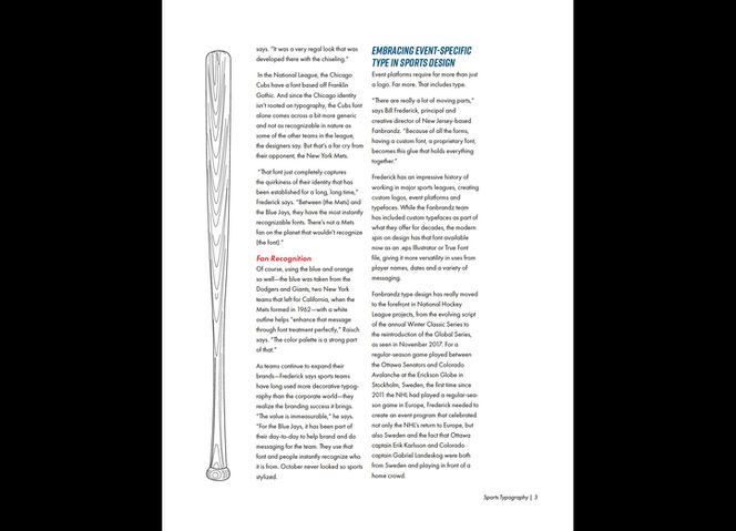
The technical paper showcases a different typography, showcasing formatting of a document/publication. In this project, I was asked to format an internet article based on typography. I chose to do a compilation of three short articles, by author Tim Newcomb, on typography in sports because of my love for sports, especially baseball. I was able to showcase my sketches (shown in my personal work design) to add my own personal flare.
Postcard
This postcard was designed specifically for an offset lithography printing process/press. We tested color and registration (especially on thin lines). We were able to design whatever we wanted to test, but it had to have process colors and thin lines somewhere on the card. My group and I were in charge of preparing the roller for the cyan unit of the press. Throughout the lab, we made adjustments to each unit as well as the sheet feeder in order to get our final result.
Flexographic Stickers
In our Flexography class, we were tasked with creating two stickers for our Mark Andy press, each with specific guidelines. We were given 2 and a half hours to design for each.
The "stoked" sticker was our first sticker. The guidelines were to create a sticker with 3 spot colors, that we chose as a class, that showcased different tints so that we were able to see the variation in halftone dots. We were able to help in the plate making process and the printing process, helping set up the equipment and registration
The second sticker was the 'Avila Beach' sticker. We were to use process colors and utilize the Mark Andy's clear varnish unit. Shown in the photo (in the overprint setting), the clear varnish was to be applied to the lavender pink color and wave lines. We also helped with plates and printing.
Foil and Clear Varnish
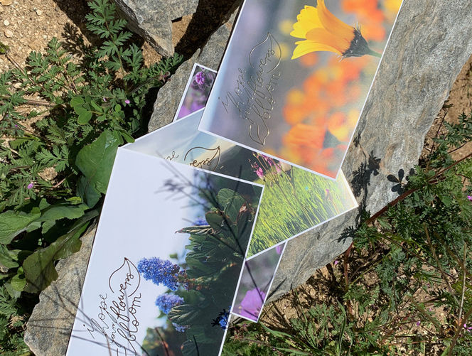
In our Digital Printing Technologies class, we utilized the MGI iFOIL Printing Press to foil emboss and add clear varnish to photos. All the photos I chose to use were photos I had taken over the years. The graphic printed on the flower cards was inspired by a graphic I drew based on a song I loved at the time. I recreated it using the pencil tool in Adobe Illustrator. The last photos show the mask layer overtop of the photos.
For the clear varnish photo, in the video below, I used a technique called texture mapping to create a wet look on the ocean, in the photo of Morro Rock.
Playing Cards
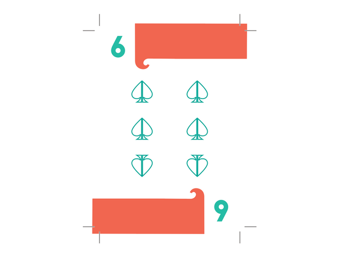
For the playing cards project I was inspired by a minimalistic beach style. I've always loved the look of the wave shape, so I wanted to play with the curve and add it to the letters to embellish them and give them a playing card feel. All of the playing cards were made using Adobe InDesign, utilizing the Master Page quite a bit to save time. The box dieline and bleed were created in Adobe Illustrator.
Children's Bookmark
The bookmark was one of my first real Adobe Illustrator projects in college. We were tasked to create a bookmark for the PIASC Raise Foundation Bookmark Competition, targeting children in Southern California. The theme for that year had to do with imagination and fantasy; therefore, I had an idea to create a chameleon who changed colors due to the book it was reading, rather than due to mood like they usually do. The whimsical fantasy book it was reading was to be about a castle and a dragon, a very fantasy concept, I had thought.
Looking back, it is definitely not my best work, but I believe my idea and concept was innovative and unique and I'm proud of my work, especially being not so experienced at the time.


Mug Painting Workshop
During the middle of the Winter Quarter, I had heard from our Specialty Manager that one of our clients had unfortunately given us a misspelled file and we had to redo a mug order and we might have to throw away the extras. I had a spur of the moment idea to create an event with the incorrect mugs, by painting over them. The design for the flyer started with shapes emulating paint strokes or paint pouring; however, I went toward more of a design that looked like the mugs we were going to paint. Much like the Valentine's flyer, I utilized our colors sycamore and poly canyon yellow.
After doing research, the process and supplies would be quite inexpensive and we would earn over a 70% profit per mug if we charged $5 for each mug. The paint, paint brushes, and mug were provided and students could come in and take a break from the busy midterm season to paint and destress. Overall, the event was a huge success and I wish we had had time to promote it earlier because many students loved the idea and would've loved to have had time to tell their friends. Both the Specialty Manager and I had plans to do another workshop this Spring Quarter; however, with COVID-19 we are passing off the idea to the next team!
University Graphic Systems

University Graphic Systems
Info Card
When I first became Sales Manager at UGS, I remember asking the previous manager what they gave out to potential clients after she met with them. I was a little embarrassed of what she pulled up on her screen to print, before our first round of in person cold calls. I knew that it had to be a goal of mine to create something more informational and more graphic than what we had.
My interns and I worked Winter Quarter to create ideas for the design direction. The final version was something I put together, utilizing elements from both of their ideas and some of my own. We ended up with a double-sided, 8x6 informational card. We frequently get questions about who we are, where we are, and what we do, so our card focuses on those areas as well as, our new mantra "Print. Create. Innovate." and how they can order from us. It is safe to say, I am much more inclined to hand this out to potential clients than the last flyer.


Valentine's Campaign
University Graphic Systems
During the month of February, the Marketing Managers and I, the Sales Manager created a Valentine's Campaign to encourage students and others on campus to place orders and come in and visit UGS. For the whole month of February people were able to bring in a friend or 'Valentine' to UGS and receive a 14% discount on both orders, if they brought in the coupons. I created the poster to try and grab the attention of those who walked the halls of campus, where we had put them up all across campus. The flyer included colors like pink and red to keep with the theme, as well as our brand colors sycamore, poly canyon yellow, and gray.
One of the Marketing Managers and I both went to the highest traffic student area and set up a booth with free candy, a spinning wheel with prizes and collateral to showcase UGS and its services. We handed out coupons to the students who passed by and spoke to everyone about the promotion in hopes they would utilize the coupons. Unfortunately, our main press broke down shortly after we had gone out and talked to students, so the campaign was not as successful as we would've liked; however, it was a great learning experience and I believe if the circumstances were different more people would have come in.


